< back to kame in july
2002
for the full TypeCon report
< back to home
>> see John at work
on house industries' site
>> see the TypeCon website
[< first photo by Anna Prior]
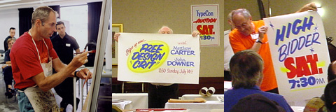
TypeCon 2002:
John Downer's workshop on hand-lettering
a brief manual on-the-fly,
based on my notes taken during John's presentation. i found it very clear
and inspiring, and felt his simple instructions should be available to everybody
interested in this classic but vanishing skill.
John was so friendly as to review and edit my draft, and give his approval
- thank you!
in-store banners:
use high-grade butcher paper. sketch with charcoal
first, loosely.
then trace only the best lines with pencil, and wipe the charcoal off, so
it won't mess up the paint.
before lettering, highlight desired areas with day-glo spray first, and let dry well.
use solvent-based paint to avoid wrinkling the paper
(which would be caused by water-based paint):
Sign Painters' 1-Shot poster color + "Reducer 6000" to thin the paint down
substantially.
signpainter's brush - long hair keeps enough paint
for large strokes. flat shape provides precision.
keep it in nondetergent motor oil.
use a 'palette' card (just a piece of cardboard) to
control the amount of paint in your brush;
use the brushed-off excess paint later as you go.
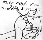
(1) overhand technique: steady the painting hand with
the other hand that holds the paint cup.
only rest the supporting hand on middle & ring finger.
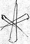
(2) if the paint drips, paint an X through it to create a "star" ;-)
two colors are always better than one! but stick with
basics, don't go overboard:
no more than 3 colors!
be conscious of seasonal colors -- halloween, 4th of july etc.
avoid using dates -- you want your discount period
to be flexible.
prices should fill half the size of the banner, or more. minimum is one-third.
big prices always look like a bargain, even if they aren't.
letterform styles:
1- to 2-stroke style:
first draw all strokes once loosely, to see the overall rhythm and where it
needs to be refined later. square off the terminals only roughly.
adjust stroke widths, spacing, counters, terminals etc. later, once all letters
are roughly there.
in bold styles,
balance all counterforms, negative shapes, letterspaces!
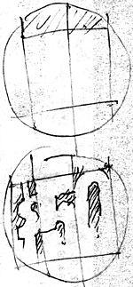
built-up letters:
do small counterforms first.
(3) it's o.k. to let shapes crash into each other.
"cut-in" (painted dark background leaving letters
a lighter color):
(4) divide spaces first, then take rectangles down.
truck lettering, "scripts":
use Sign Painters' 1-Shot "Lettering Enamel" -- needs
to be thinned too, to create smooth swift shapes.
if the result is too translucent, paint over it again.
"a lot of time is saved by allowing irregularity" -- keep shapes funky-fresh.
upright script: use non-script (casual) caps, which
look fun with script-style lowercase.
slanted script: looks better with equally slanted real-script caps. paint
thin lines, swirls, swashes etc. afterward, add thin connecting strokes from
upper right to lower left.
know when to stop -- don't overfinish it, keep it fresh-looking!
...and a final note from John:
Joachim, one last item I think is worthy of mention:
One way I save time on my paper grocery store signs
for windows is to abbreviate words, and to use slang. In the same manner as
"potatoes" gets shortened to "spuds" and "soft drinks" gets shortened to "pop",
the word "cucumbers" would be reduced to "cukes."
The "veggies" in our Produce Dep't. are Farm Fresh!
Nice work on the sketches you did during my demo.
Cheers, John
(1) the overhand technique